.jpeg?width=682&height=507&name=AdobeStock_67977657%20(1).jpeg)
When KPIs are graphed month-by-month during a fiscal year, you may be tempted to overreact to a bad month – or even a good one.
While monthly KPI charts are certainly relevant and reflect your real numbers, they just don’t account for seasonality – or what the actual state of your business is.
 On top of monthly KPI charts, it’s a good idea to produce a trailing twelve month version of each chart to get a more accurate portrayal of business conditions.
A Trailing Twelve Month (TTM) chart depicts a company’s performance trend for a rolling 24-month period. Each dot on the chart represents a cumulative total for the 12 months immediately prior to that date. The change from month to month is:
The net increase or net decrease of the month added vs. the month deleted
Let’s go into what adding this chart to your KPI arsenal can do for your business.
TTM in Greater Detail
As we mentioned earlier, a company's TTM depicts its performance trend for a rolling 24-month period. But how does this help you make better business decisions?
The true benefit of using the Trailing Twelve Month method to graph KPIs is that it eliminates seasonality – those fluctuations in the business that regularly occur year to year.
This includes artificially inflated costs like seasons or holidays that could impact the demand for a product or service (i.e. ice sales go up in the summer and down in the winter). The TTM format for charting KPIs paints a truer picture of the economic health of a business, because it adjusts for seasonality by tracking data over a longer period of time.
From here, you can refine your KPIs and become proactive about situations, rather than worrying about a single bad month. This will help you drive sales and improve processes across the business.
Why the TTM Trend is Your Friend
TTM charts, once harnessed properly alongside your KPIs and key leading indicators (KLIs), have enormous power to provide quick insights. You’ll have a real-time pulse on your earnings – and whether the business is in trouble, or it’s profiting.
These aren’t projections, but a tangible earnings calculation of your actual latest performance. This is helpful for potential investors, especially in the mergers and acquisitions sector.
We know that on a traditional graph, one month’s data is shown as a single data point. A graph needs 2 points to make a line and 3 points to show a trend.
A CEO must see KPI trends in order to monitor how revenue, gross profit and net income change over time and determine if the business is improving, staying the same or getting worse. That’s using the mindset of a strategic CEO.
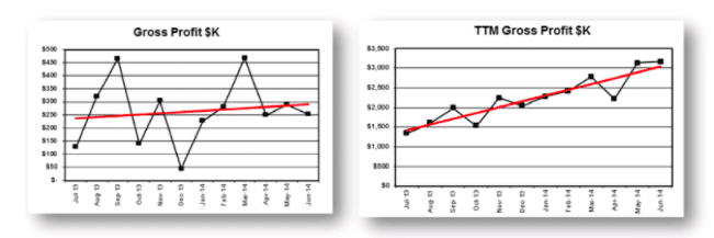
The 2 charts below highlight the differences between a normal trend line and a TTM trend line of the same data:

The chart on the left shows gross profit data points that jump up and down. These “shark teeth” often are a result of having cash basis versus accrual basis financial reports.[MD1] How can you make actionable plans and determinations with so many fluctuations? Unnecessary time is spent debunking seasonalities, a bad month or otherwise.
When comparing the 2 graphs, over the course of the year you can see the red trend line on the left is relatively flat, but the chart on the right shows a different story. Both charts show the power of data presentation, and what it tells us. The trend line on the right points out that gross profit has improved from $1,500 to $3,000 in 1 year – providing a significantly better outlook.
Get the Highest Possible Value
You can see how valuable having a TTM chart in your business is. By having the ability to quickly glean growth or decline from your most recent quarters, you can make strategic decisions to drive sales and help other departments succeed based on what’s working and what isn’t.
The TTM format should always be used to track leading indicators, such as total income, gross profit and net income on the company scorecard. Those essential KPIs should be evaluated as trends over the trailing twelve months in management reports.

.png?width=563&height=144&name=New%20GF%20Logo%20(37).png)
